-
Spread Windows Forms 18 Product Documentation
- Getting Started
-
Developer's Guide
- Understanding the Product
- Working with the Component
-
Spreadsheet Objects
- Understanding Parts of the Component
- Object Parentage
- Resetting Parts of the Interface
- Rich Text Editing
- Improving Performance by Suspending the Layout
- Ways to Improve Performance
- Allowing User Functionality
- Allowing the User to Zoom the Display of the Component
- Working with Scroll Bars
- Adding a Status Bar
- Customizing Viewports
- Customizing Split Boxes
- Working With Slicers
- Working with Built-In Dialogs
- Ribbon Control
- Sheets
- Rows and Columns
- Headers
- Cells
- Cell Types
- Data Binding
- Customizing the Sheet Appearance
- Customizing Interaction in Cells
- Tables
- Understanding the Underlying Models
- Customizing Row or Column Interaction
- Formulas in Cells
- Sparklines
- Keyboard Interaction
- Events from User Actions
- File Operations
- Storing Excel Summary and View
- Printing
- Chart Control
- Customizing Drawing
- Touch Support with the Component
- Spread Designer Guide
- Assembly Reference
- Import and Export Reference
- Version Comparison Reference
Adding a Status Bar
You can add a status bar to the component. The status bar allows you to set zoom settings and displays information such as the average, sum, and counts for selected cells.
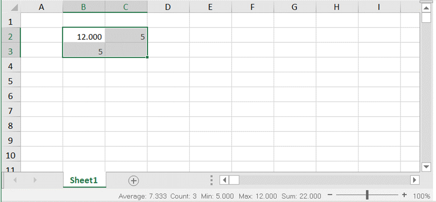
The following image displays the sum, average, count, and zoom slider in the status bar.

The StatusBar uses the formatter of the active cell to display the text. It displays the value of the active cell along with its formatter. For example, If the active cell has a NumberCellType with DecimalPlaces set to 3, then in the StatusBar it will display the value with three decimal places.
The following options are available in the status bar.
Option | Description |
|---|---|
Average | This option displays the average from the selected cells that contain numerical values. |
Count | This option displays the number of selected cells. |
Minimum | This option displays the minimum numerical value in the selected cells. |
Maximum | This option displays the maximum numerical value in the selected cells. |
Numerical Count | This option displays the number of selected cells that contain numerical values. |
Sum | This option displays the sum of numerical values in selected cells. |
Zoom (100%) | This option displays the zoom level. Select the zoom percentage to display a dialog that allows you to set additional magnification options. |
Zoom Slider | This option displays a slider with plus and minus buttons for changing the zoom options. |
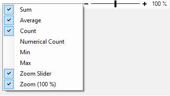
You can right-click on the status bar to display menu options that you can check or uncheck.

Setting Method
You can display the status bar by setting StatusBarVisible property of FpSpread class to true.
Sample Code
This example adds a status bar to the component and sets colors for the status bar.
fpSpread1.StatusBarVisible = true;
fpSpread1.StatusBar.BackColor = Color.LemonChiffon;
fpSpread1.StatusBar.ZoomSliderColor = Color.Turquoise;
fpSpread1.StatusBar.ForeColor = Color.OliveDrab;
fpSpread1.StatusBar.ZoomButtonHoverColor = Color.Gold;
fpSpread1.StatusBar.ZoomSliderTrackColor = Color.DodgerBlue;
fpSpread1.StatusBar.ZoomSliderHoverColor = Color.BurlyWood;
FpSpread1.StatusBarVisible = True
FpSpread1.StatusBar.BackColor = Color.LemonChiffon
FpSpread1.StatusBar.ZoomSliderColor = Color.Turquoise
FpSpread1.StatusBar.ForeColor = Color.OliveDrab
FpSpread1.StatusBar.ZoomButtonHoverColor = Color.Gold
FpSpread1.StatusBar.ZoomSliderTrackColor = Color.DodgerBlue
FpSpread1.StatusBar.ZoomSliderHoverColor = Color.BurlyWoodUsing the Spread Designer
Select Spread in the Properties window.
Set StatusBarVisible property to true.
See Also
Understanding Parts of the Component
Resetting Parts of the Interface
Improving Performance by Suspending the Layout
Allowing the User to Zoom the Display of the Component
Understanding Parts of the Component
Resetting Parts of the Interface
Improving Performance by Suspending the Layout


